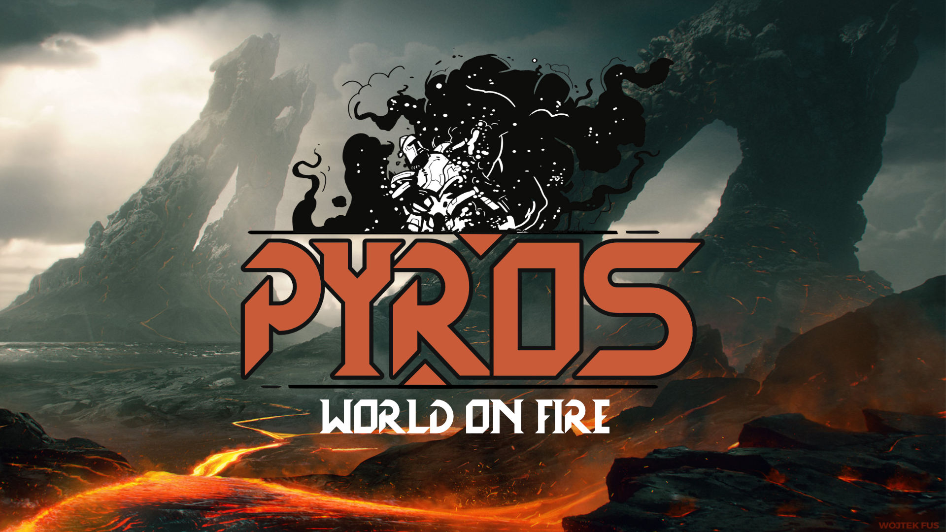
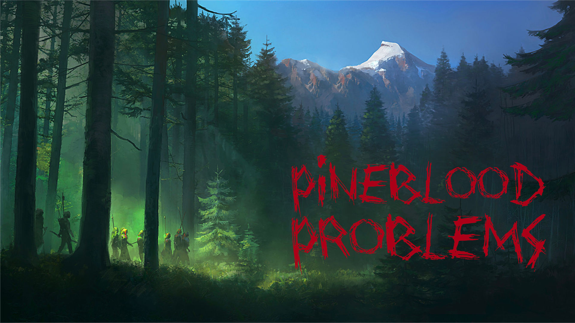
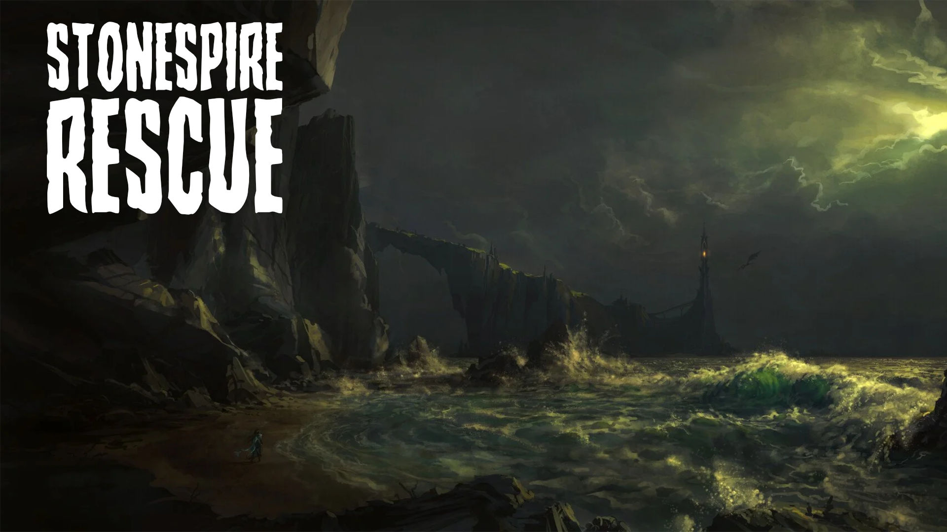
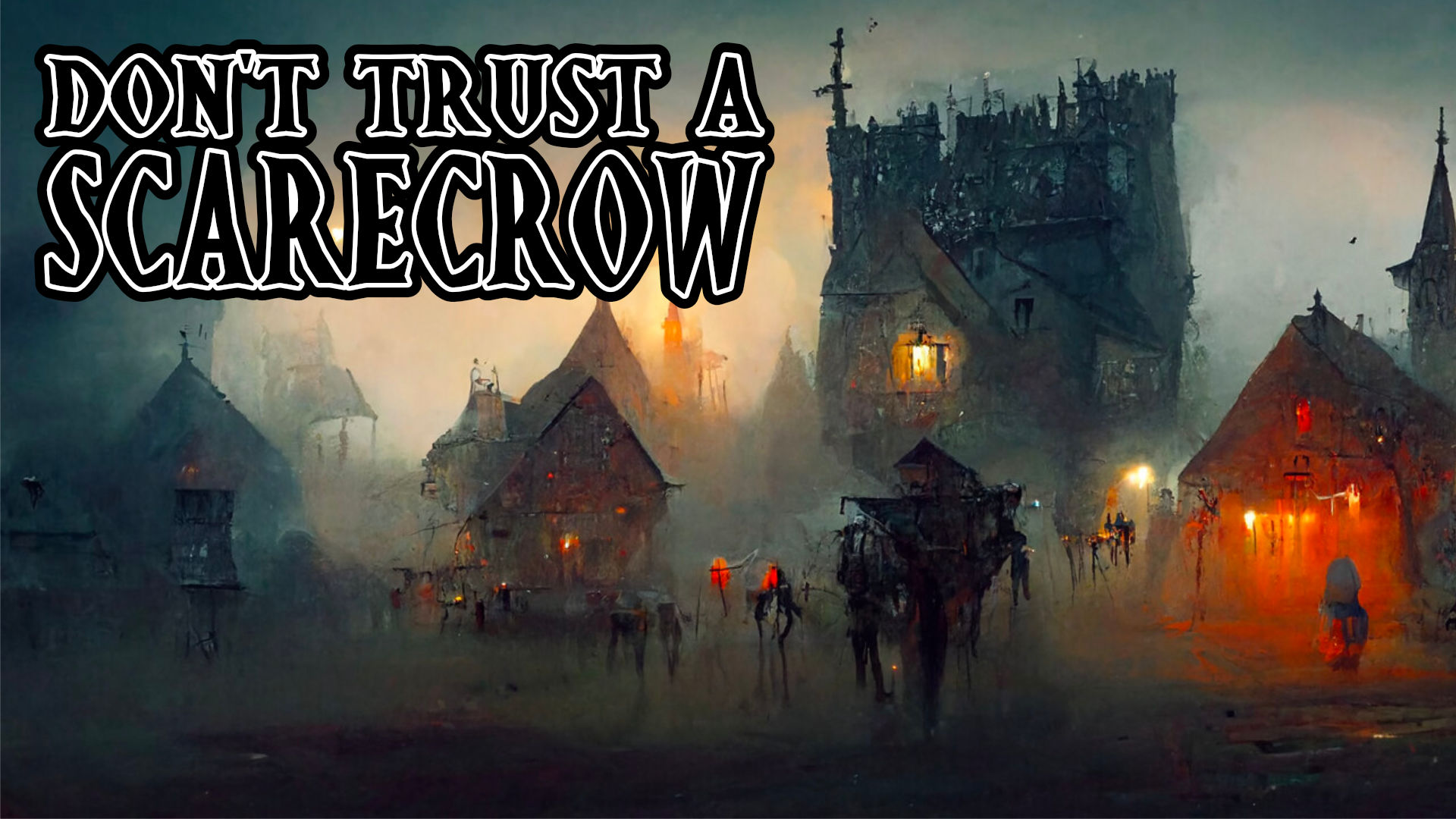
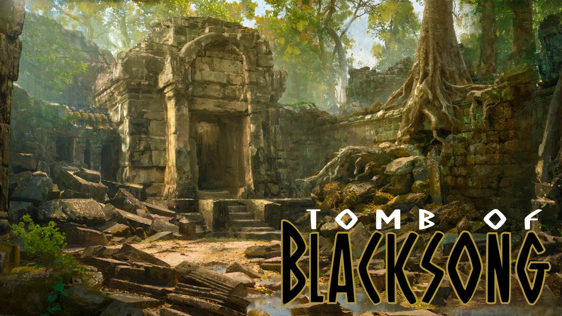
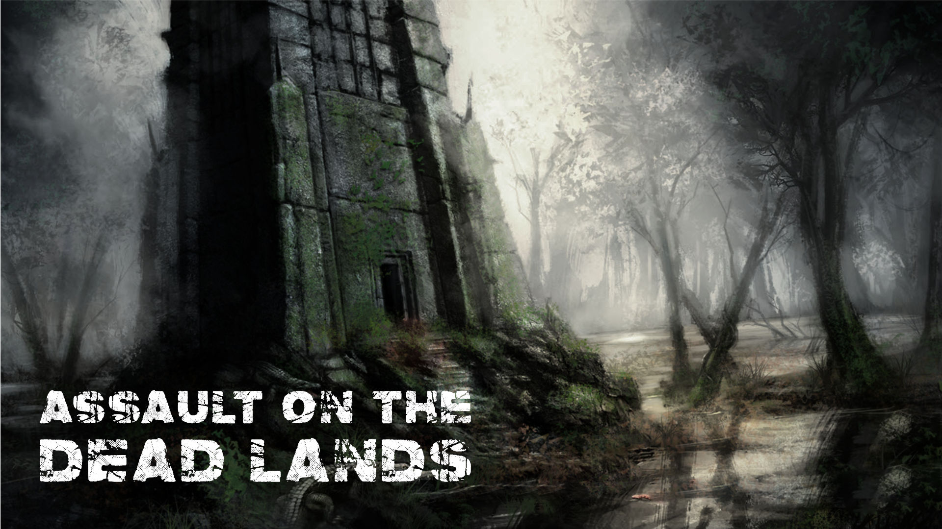
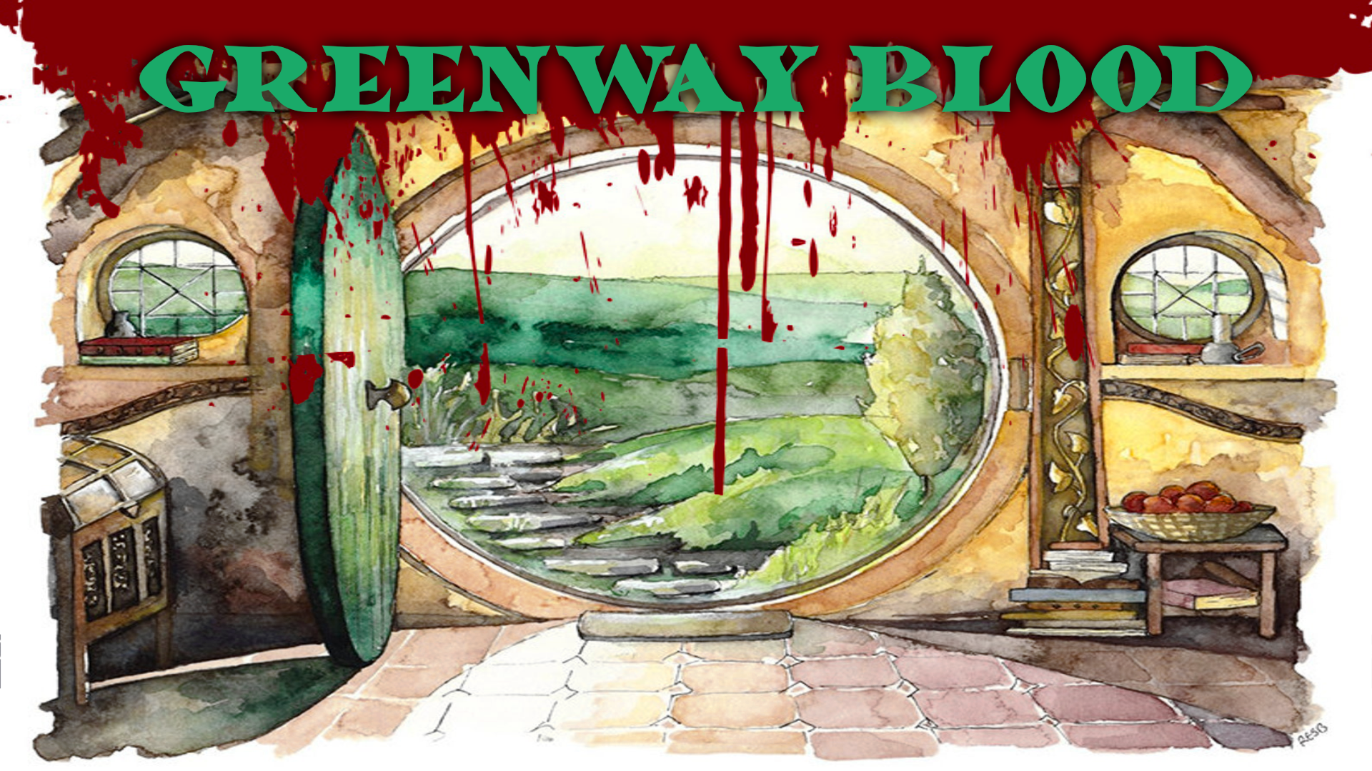
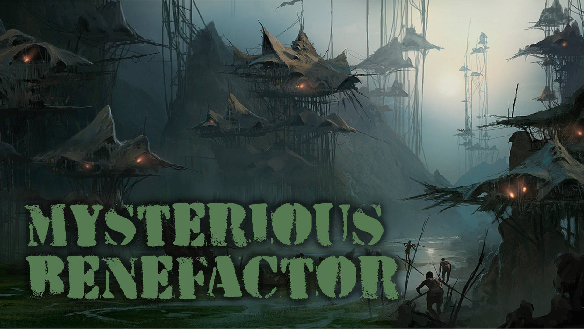
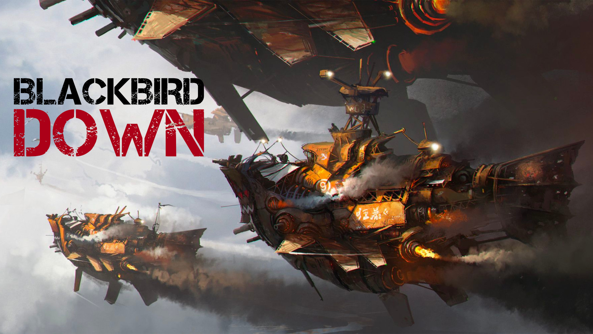
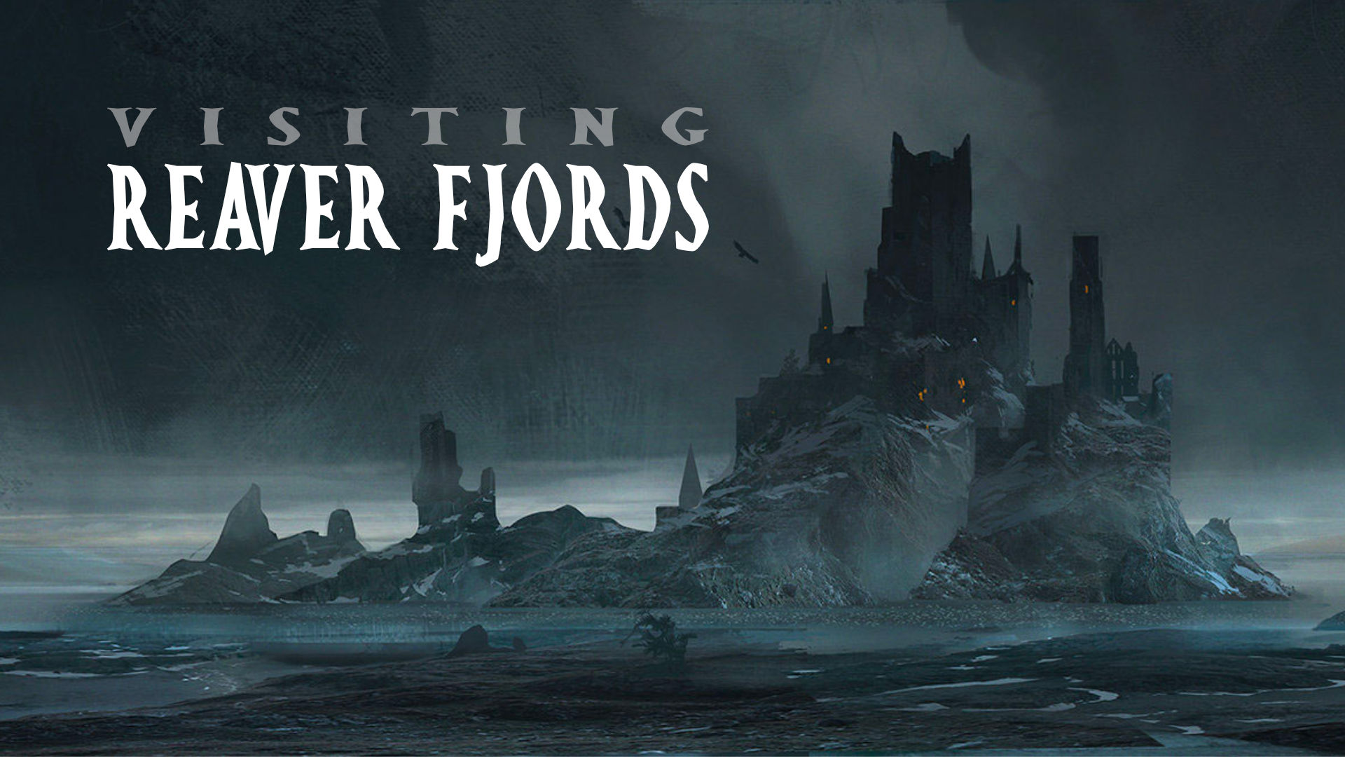
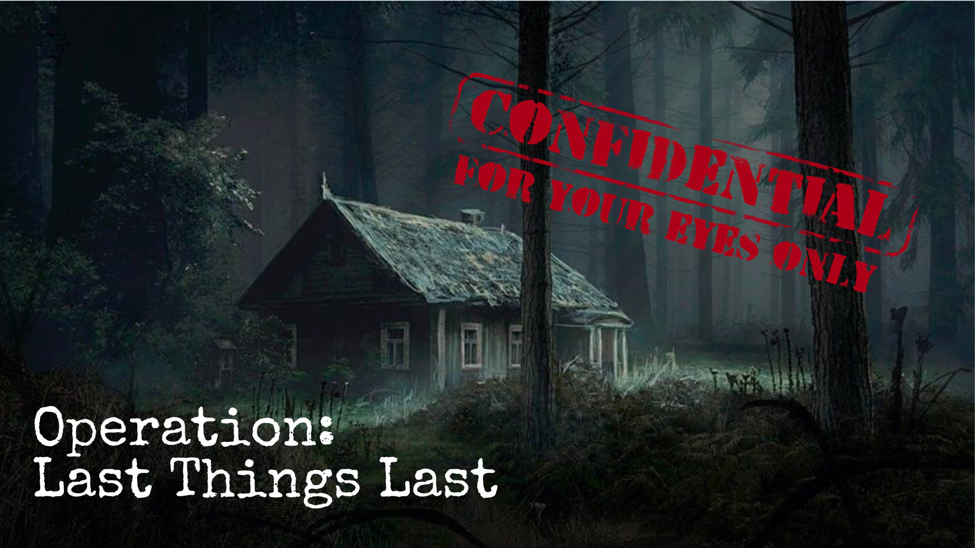
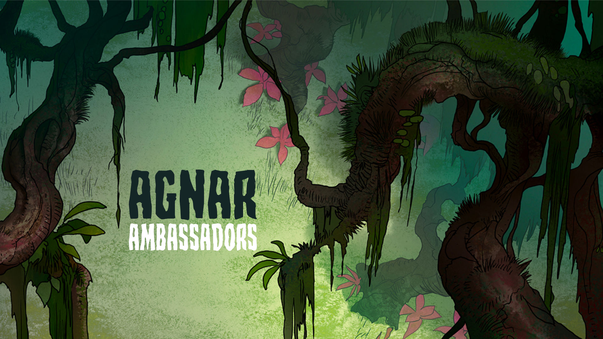
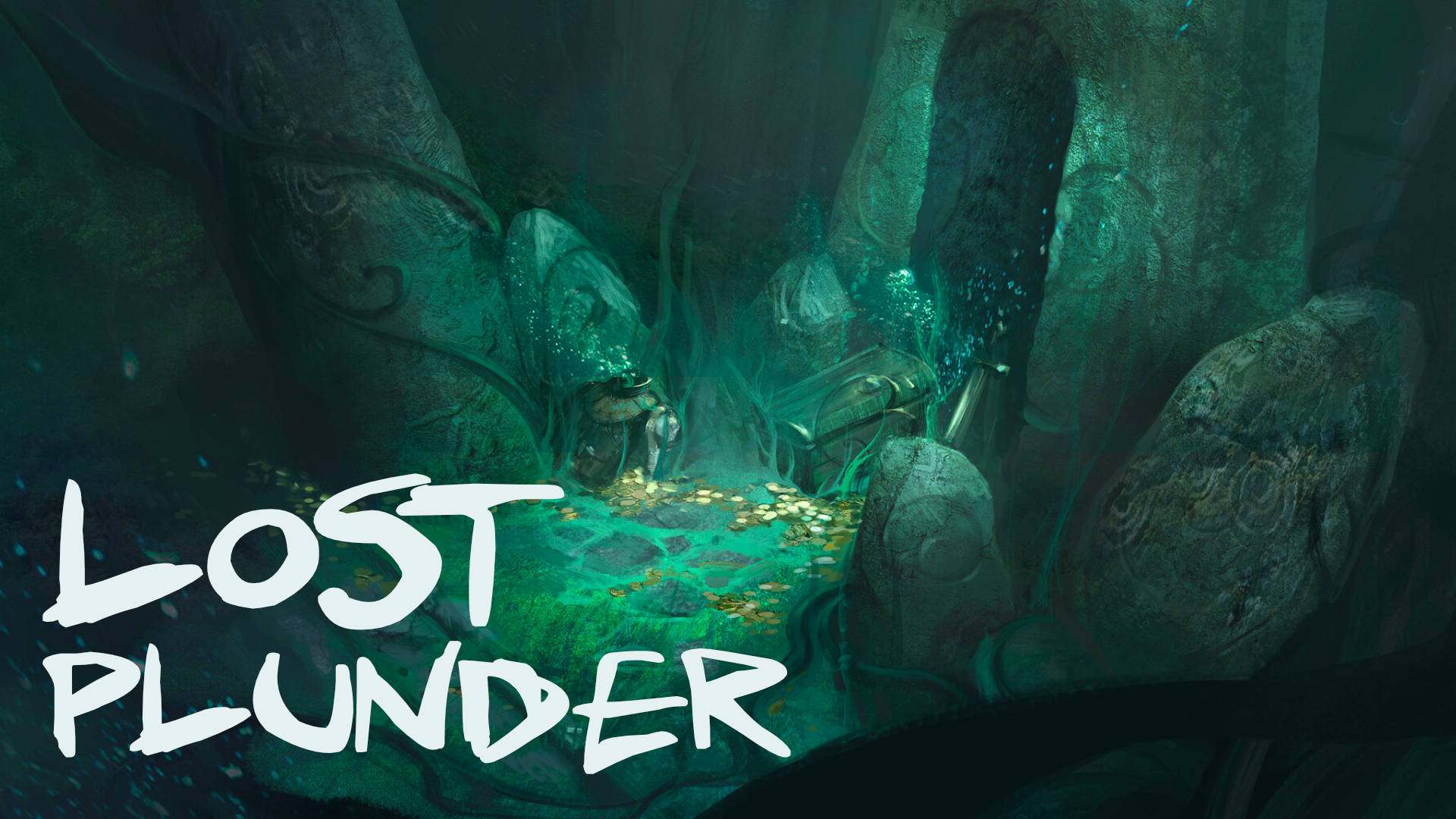
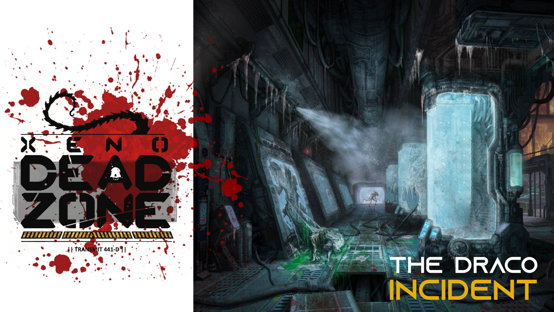
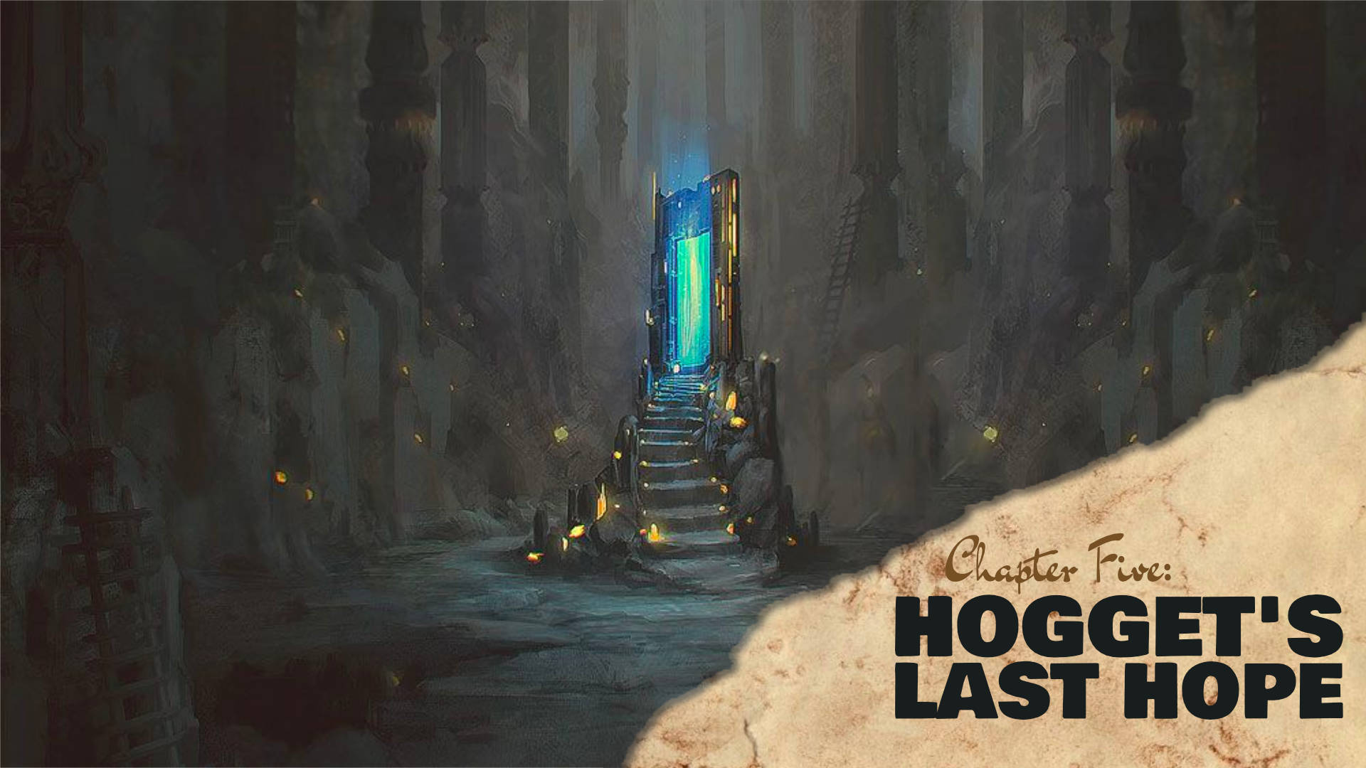
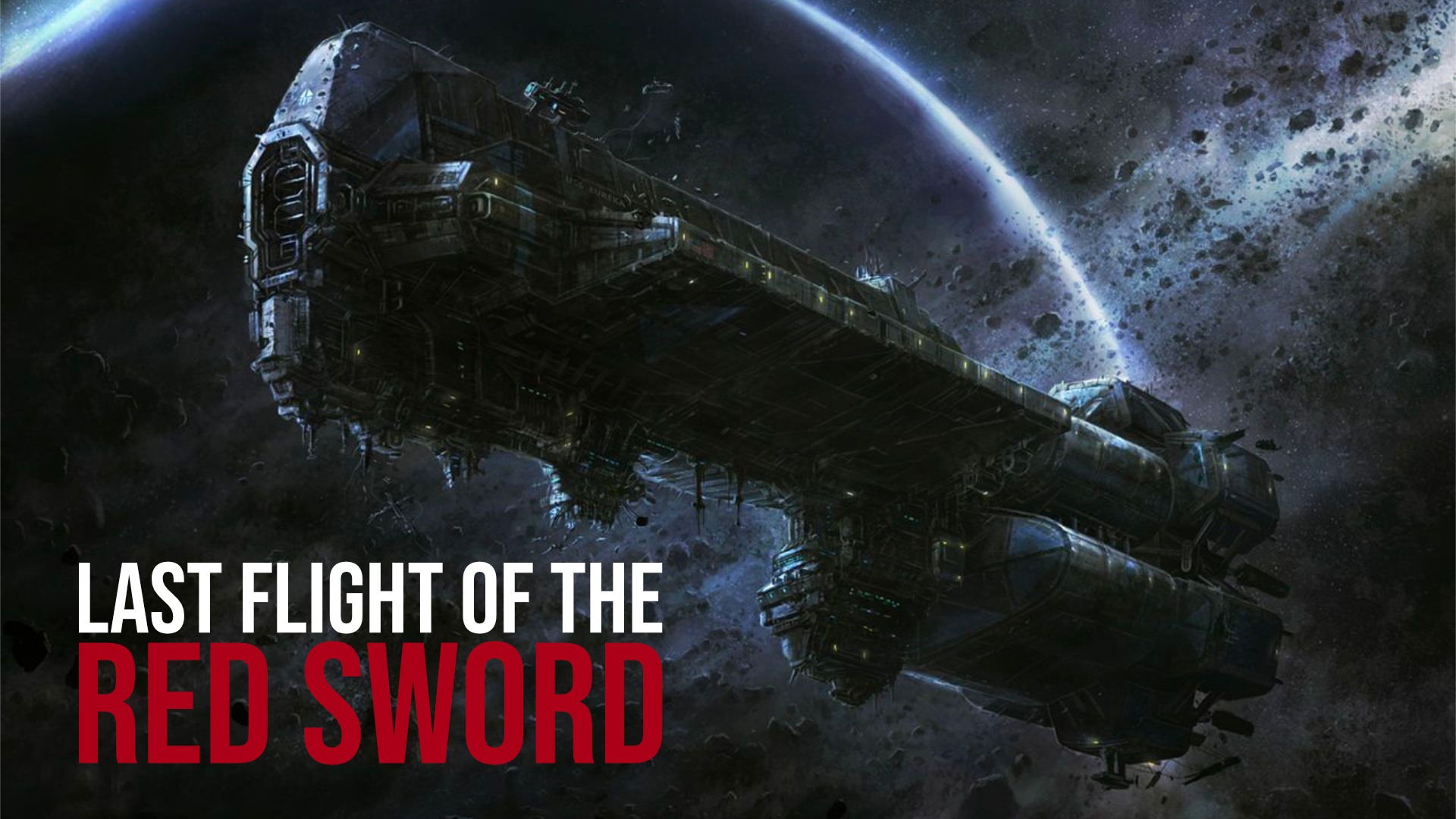
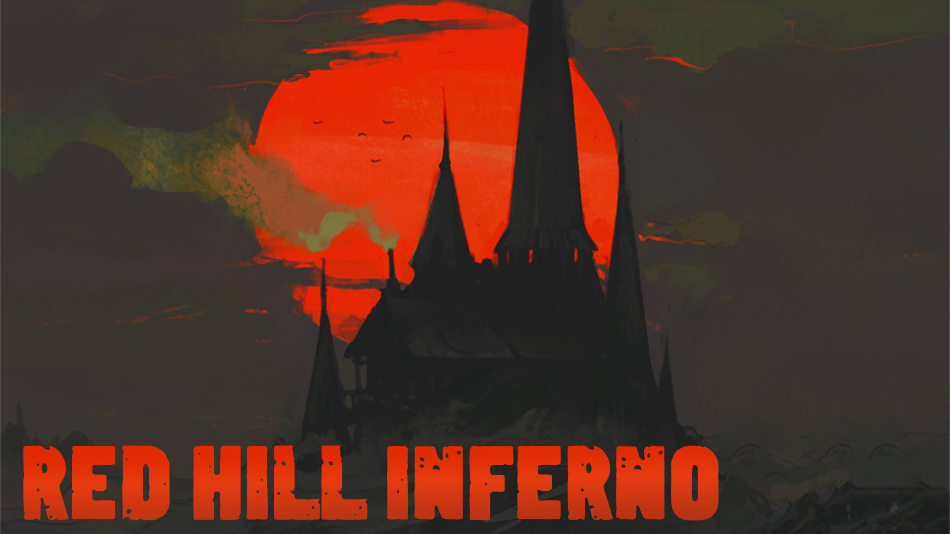
Before every VTT game, I like to start the game off with a splash page. An opening image that declares the name of the session and often shows the cast of characters as they log in. It also helps set the scene before the session starts.
But because there’s already so much to do in prepping a virtual game, I had to find a simple way to create the splash page and then move on to the meat of the game. After some trial and error, I wanted to share what my process has become.
Background Art
A good piece of art can be a great campfire to gather around when playing virtually. It visually sets the tone and might even clue players to what kind of game they’re about to play. Let’s find that first piece of art!
Google is your friend here and so I usually think about the kind of environment the game will be set in. “Desert Canyon”, for example.
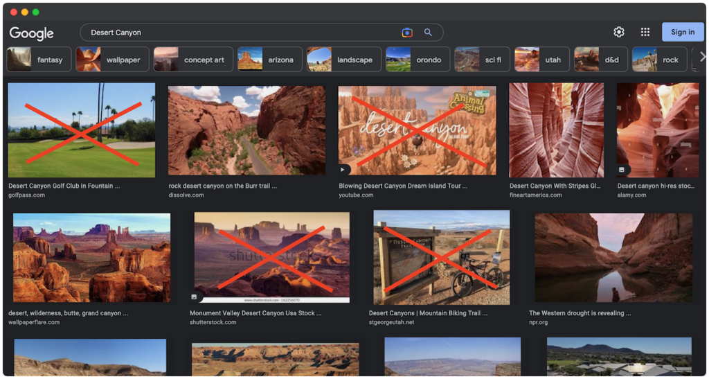
When you search for it though, you’ll probably find a lot of pictures that just don’t work. I’m not looking for a picture of someone hiking through a desert canyon or an advertisement for a national park. I want an art piece that is evocative but also works as a background.
So instead of just searching for “Desert Canyon”, I’m going to add extra keywords to focus my search to what I’m thinking. Here are a few examples:
- … concept art
- … digital art
- … environmental concept
- … etc.
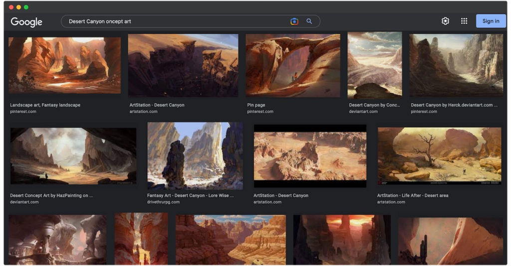
If “Desert Canyon concept art” doesn’t work, you can also try thinking laterally for adjacent descriptions of the same thing. Instead of “Desert Canyon”, try “Desert Gully” or “Wasteland Cliff”.
It’s only a matter of time before you find something that works and you can move it over to editing software like Photoshop or Affinity Photo.
Session Name
Once I’ve got things set up (usually it’s a 1920×1080 document at 72 dpi), I drop in the image and go to work.
I try not to fiddle with images too much, but occasionally I’ll tweak or cut something out so it’s not distracting from the background. Little silhouettes or small elements that don’t fit with what I’m imagining for the session. I want this to be fast and when I’m done, I start thinking about a title.
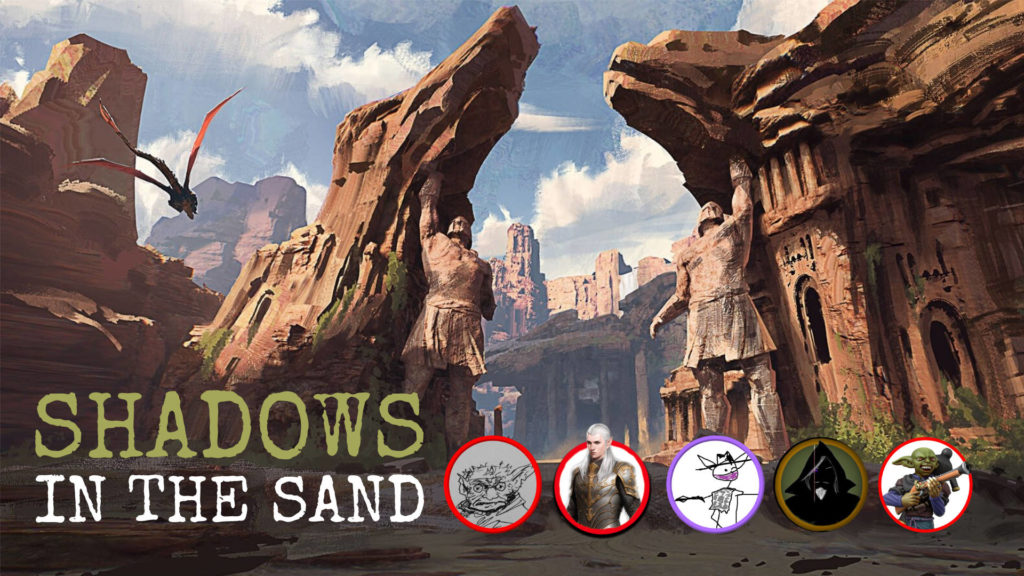
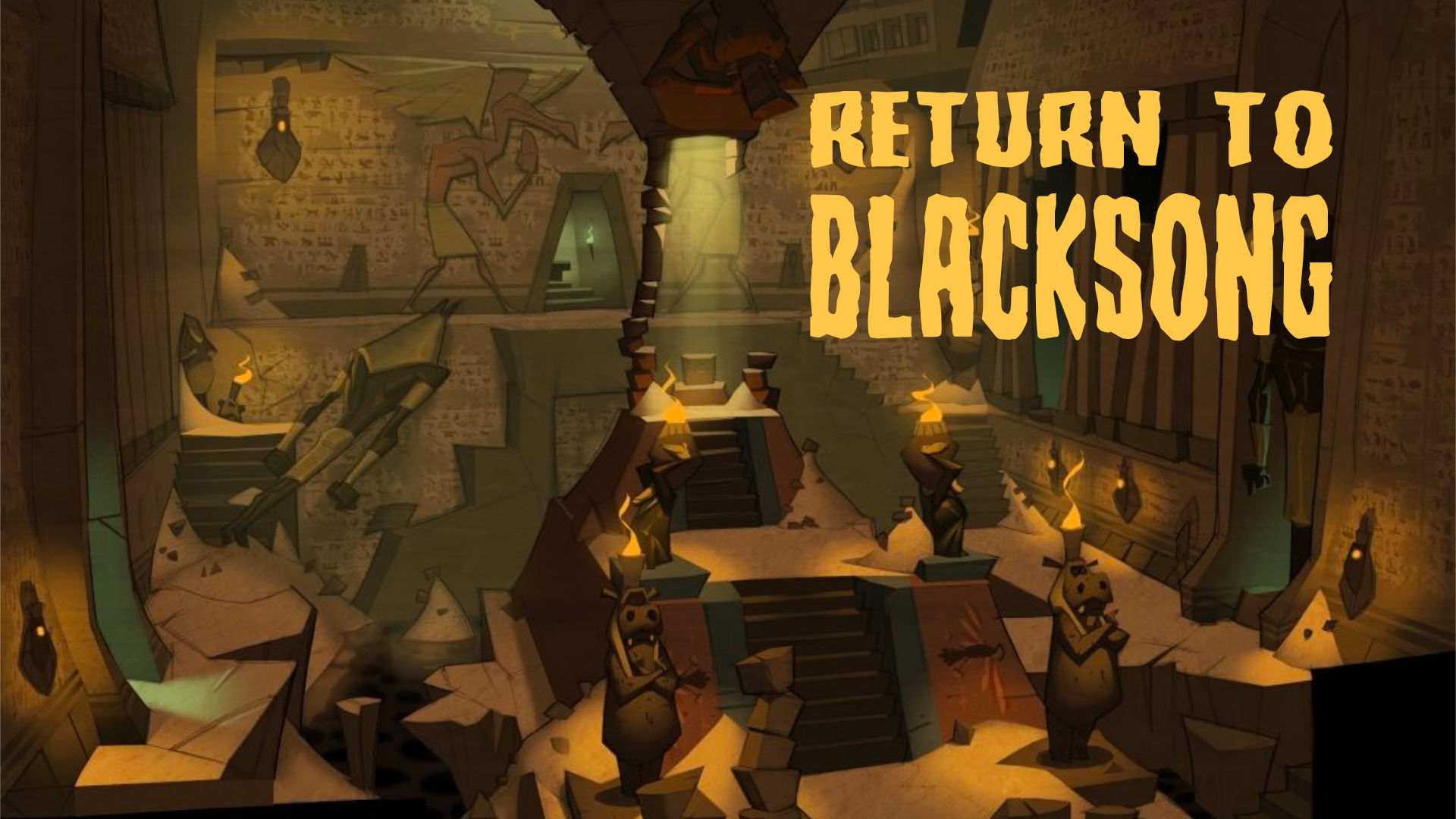
Next week, for example, I have a group of players returning to the Blacksong Tomb, so the session’s name is simply Return to Blacksong. Boom. Done. In the case of this hypothetical desert game, let’s go with Shadow in the Sand.
Something simple, catchy, and I can’t help but aliterate, if possible. Whatever it is, I want it to be only a handful of words and sum up the game. Again, developing the tone before the session even starts. Don’t be afraid to hit it right on the nose either.
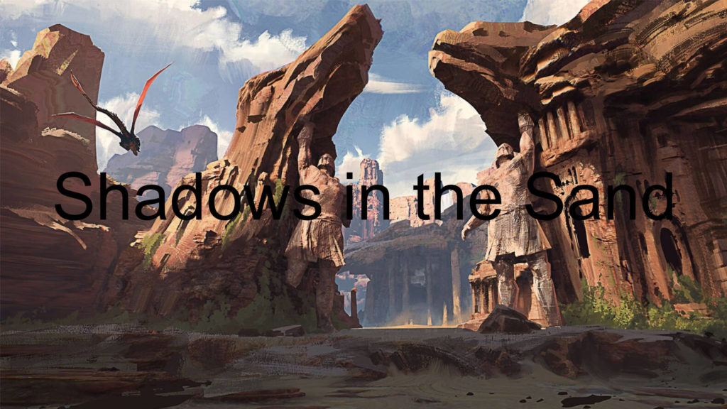
Choosing a font is next. I mean, I love Arial as much as the next guy, but it’s kind of boring. Got to find something a little more punchy. Something that fits.
Google Font is my go-to source and I’m always surprised by what I find. Sure, they may not always be the most flashy, but they get the job done. In the end, I do want the title to be legible. This one I found is called Special Elite. Worn down, typewriter. Looks perfect!
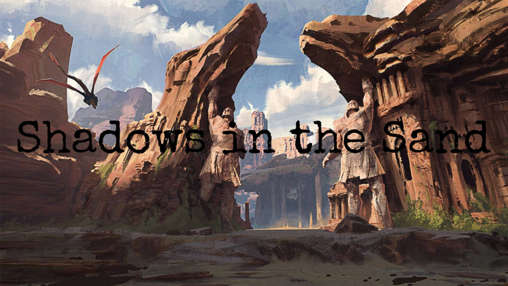
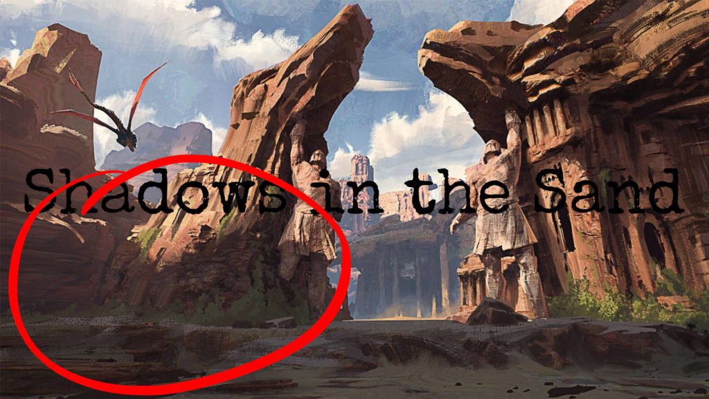
The next consideration is placement. As you can probably see, it’s hard to read even though it’s smack-dab in the center. So what I’ll look for is a bit of “open space.”
Any area that doesn’t have a lot going on. Similar colors and few details. Anything like that makes great open space because then the words stand out and don’t compete with the background. In this case, it’s the lower left corner.
Then formatting, I like to stack things and square everything up. I’ll make one line big and then resize the other words to make the large word. I find that it tightens everything up and I like out it looks.
Finally, color and formatting wrap things up. For color, I’ll look for something that stands out. Dark backgrounds get a light color. Light backgrounds get a dark color. I can sample colors directly from the image or fiddle around until I find something that works. Maybe only one word will get color and the other will just get black or white?
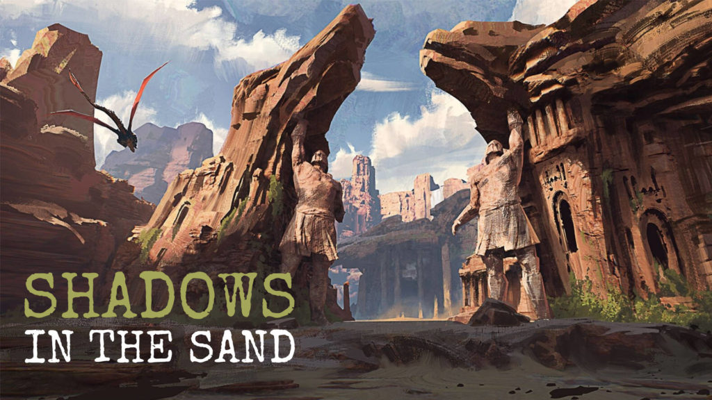
And that’s it! Now you’ve got a finalized splash page that you can drop into your VTT of choice. Once in there, you can also drop in the tokens for each character to create a nice landing space for players when it’s time to play. Add in the music playing and you’ve got your campfire.
